Last Lesson Recap
In our last lesson, we tried to answer the following questions:
What is the average number of visits for each state?
What is the average number of visits for each National Park?
How many National Parks are there in each state?
Anyone want to share their solutions?
My Solution
Here’s the solution code:
import reimport pandas as pd= pd.read_csv('https://raw.githubusercontent.com/melaniewalsh/responsible-datasets-in-context/main/datasets/national-parks/US-National-Parks_RecreationVisits_1979-2023.csv' )def split_on_uppercase(name):return re.sub(r' ( ?< ! ^ ) ( ?= [A-Z] ) ' , '_' , name).lower()= [split_on_uppercase(col) for col in parks_data_df.columns]= new_column_namesprint (parks_data_df.groupby(['state' ])['recreation_visits' ].mean().reset_index())print (parks_data_df.groupby(['park_name' ])['recreation_visits' ].mean().reset_index())print (parks_data_df.groupby(['state' ])['park_name' ].nunique().reset_index())We could store each of these in new variables, but we also want to visualize this data. That’s what we’re exploring today.
A New Dataset: Top 500 Novels
First, we need to create a new Jupyter notebook in our pandas-eda folder called Top500NovelsEDA.ipynb and then load in the data. As a reminder, how can we read data in Pandas?
Rather than working with just the National Parks data, we can also start to explore the remainder of the datasets from the Responsible Datasets in Context Project . Specifically, let’s take a look at the “Top 500 Greatest Novels” dataset by Anna Preus and Aashna Sheth.
This dataset compiles metadata about 500 novels ranked highly across multiple sources, including OCLC holdings and Goodreads ratings. It’s a great example of a dataset that is part curated list and part bibliographic metadata.
Loading the Novels Data
To load the dataset, we need to look at the GitHub repository https://github.com/melaniewalsh/responsible-datasets-in-context/tree/main/datasets/top-500-novels and find the raw URL for the final_merged_dataset_no_full_text.tsv file. Then we can use pd.read_csv() to load it:
= pd.read_csv("https://raw.githubusercontent.com/melaniewalsh/responsible-datasets-in-context/" "main/datasets/top-500-novels/final_merged_dataset_no_full_text.tsv" ,Why didn’t this work though?
Tab-Separated Values & Encoding
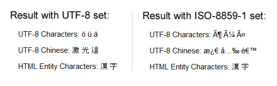
If we run this locally, we should see the following error:
ParserError: Error tokenizing data. C error: Expected 1 fields in line 163, saw 3What is encoding?
This error is telling us that there is an issue with the way the data is formatted. In this case, the dataset is actually a tab-separated values (TSV) file, which means that we need to specify the sep parameter when we read it in. Encoding errors are common when working with data, especially data that was produced by others. The reason for this is that different operating systems and software use different character encodings to represent text. When we save a file, it is encoded in a specific way, and when we open it, we need to know how it was encoded in order to read it correctly.
ISO-8859-1 and utf-8 are both character encodings used to represent text in computers. ISO-8859-1, also known as Latin-1, is a single-byte encoding that can represent the first 256 Unicode characters but only covers Western European languages. On the other hand, utf-8 is far more popular because it is a variable-width character encoding that can encode all possible Unicode characters.
Revised Loading the Novels Data
In our case, we didn’t need to specify the encoding, but if we did, we could have added the encoding parameter to our read_csv() method.
# Import data = pd.read_csv("https://raw.githubusercontent.com/melaniewalsh/responsible-datasets-in-context/main/datasets/top-500-novels/final_merged_dataset_no_full_text.tsv" , sep= " \t " , encoding= 'utf-8' )
Missing Data in Pandas
author_field_of_activity 329 non-null objectauthor_occupation 458 non-null objectIn the last lesson, we covered how we could add null values to a DataFrame, but now we want to explore how we can work with them. Pandas has a lot of documentation for handling missing data that you can read here https://pandas.pydata.org/docs/user_guide/missing_data.html . For our purposes, we’re mostly concerned with the isna() and notna() methods. What does 329 non-null mean? Let’s return to the documentation to find out .
The info() method shows us that some columns have missing values. For example, author_field_of_activity has 329 non-null values, which means 171 values are missing.
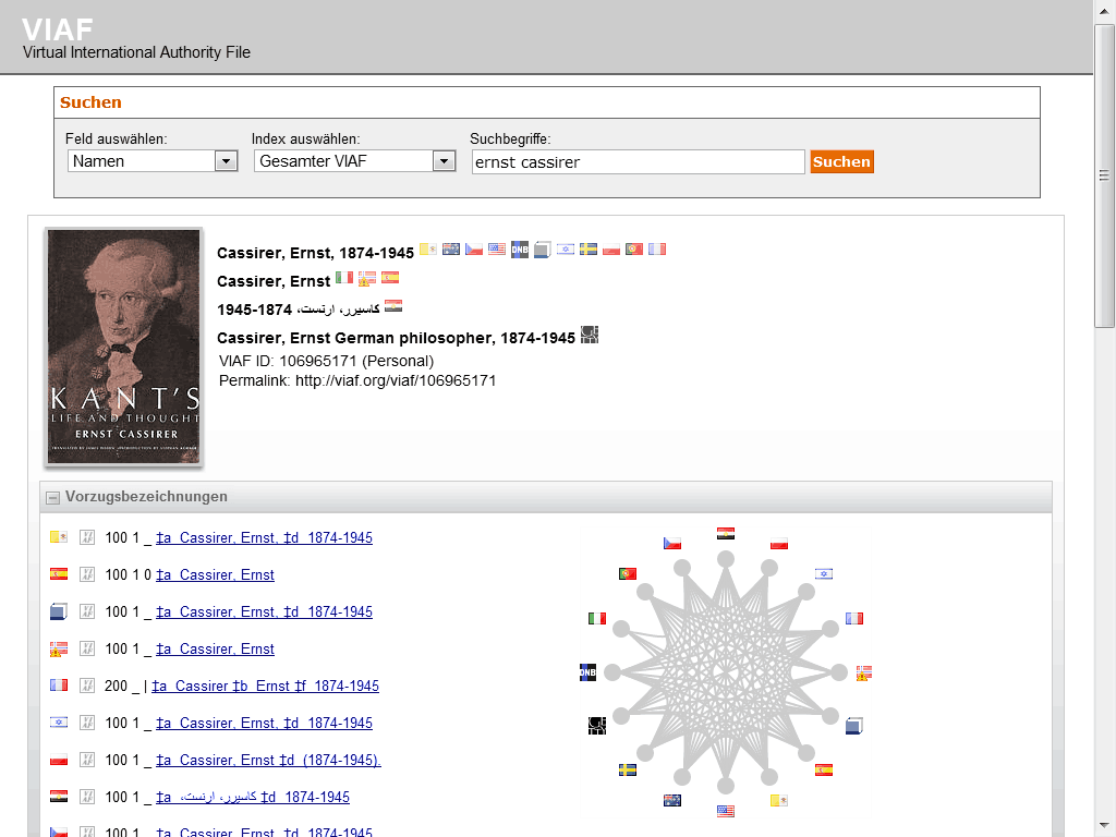
Why? This column comes from VIAF — the Virtual International Authority File. VIAF is a service that links authority records across libraries and institutions. Not every author in our dataset has a VIAF record, which is why some values are missing.
Pandas has a lot of documentation for handling missing data at https://pandas.pydata.org/docs/user_guide/missing_data.html.
AUTHOR_FIELD_OF_ACTIVITY
From the documentation, we can learn the following about this column:
AUTHOR_FIELD_OF_ACTIVITY: Author’s primary fields of activity, according to VIAF. VIAF includes data from multiple global partner institutions, but we only collect VIAF data associated with the Library of Congress (LOC).
VIAF: The Virtual International Authority File
For those unfamiliar, VIAF stands for the Virtual International Authority File, which is a service that provides a way to link and share information about authors and their works across different libraries and institutions. The idea for VIAF originated in 1998 as an experiment in trying to link authority records. As a reminder, authority records are standardized records that provide information about a specific entity, such as an author or a work, like MARC records. VIAF was officially launched in 2003 and is operated by the Online Computer Library Center (OCLC) in partnership with various national libraries and institutions.
The impetus for the creation of VIAF was not just sharing information, but what LIS scholar Christine L. Borgman calls the “scaling problem in name disambiguation” in her book Big Data, Little Data, No Data: Scholarship in the Networked World . We’ve already talked about this briefly in discussing the challenges of “cleaning data”, but the rise of multiple digital libraries and archives has made it increasingly difficult to accurately identify and attribute works to their correct authors, which is where projects like VIAF come in. However, as we discussed in class, there are still challenges with this system. For example, authors are not the ones who enter data into VIAF. Instead, it is often librarians or archivists who are responsible for creating and maintaining these records. This means that there can be discrepancies in how authors are represented, and it can be difficult to ensure that all works by a particular author are accurately attributed to them.
Handling Missing Values
Now knowing this background, we can start to explore which authors have missing values in this column. We can do this by using the isna() method to check for missing values in the author_field_of_activity column.
'author_field_of_activity' ].isna()]
Here we are using the isna() method to filter our DataFrame to only show rows where the author_field_of_activity column is null.
Handling Missing Values
If we wanted to see only rows where the column is not null, we could use the notna() method instead.
'author_field_of_activity' ].notna()]This will give us a DataFrame with all the authors who have a field of activity listed. We could also use the ~ operator to negate the boolean values returned by isna().
~ novels_df['author_field_of_activity' ].isna()]
We haven’t seen the ~ operator before, but it is a common way to negate boolean values in Python. So for example, if we had a boolean variable x that was True, then ~x would be False. In addition, Pandas also has isnull() and notnull() methods that can be used interchangeably with isna() and notna().
Handling Missing Values
Finally, if we wanted to get rid of all rows in the novels_df DataFrame that have missing values in the author_field_of_activity column, we could either use our filtering logic to assign the result to a new variable or we could use the dropna() method.
= novels_df.dropna(subset= ['author_field_of_activity' ])dropna() is a powerful method that can be used to remove missing values from a DataFrame. The subset parameter allows us to specify which columns we want to check for missing values. If we don’t specify a subset, dropna() will remove any row that has a missing value in any column.
Handling Missing Values
Here’s a quick overview of the most common methods for handling missing values in Pandas:
isna()Boolean mask for missing values
df.isna().sum() to count missing
notna()Boolean mask for non-missing values
Inverse of isna()
isnull()Alias for isna()
Interchangeable with isna()
notnull()Alias for notna()
Interchangeable with notna()
dropna()Removes rows/columns with missing values
Use subset= to target columns
fillna()Fills missing values
Replace with a value or interpolate
Knowing how to work with missing data is important since we often have gaps when working with cultural datasets. Furthermore, it’s important to know that certain methods like groupby() will automatically ignore missing values, so we should always check the distribution of our data before we start analyzing it.
Merging Data With Pandas
Now that we are understanding how to work with missing data, we can also start to explore how to augment our dataset in various ways. One of the most common ways to do this is through merging datasets together.
We’ve already seen one approach pd.concat() that allows us to concatenate DataFrames (aka add them together), but now we want to focus on the merge() method.
First though we need another dataset to merge with our novels_df. We could take a look at sites like Kaggle to find more datasets, or more specific ones like the Post45 Data Collective , which “peer reviews and houses literary and cultural data from 1945 to the present” https://data.post45.org/ .
NYT Bestsellers Dataset
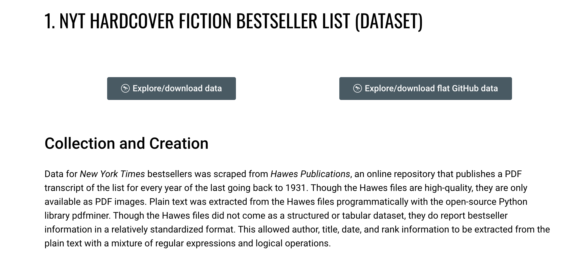
Let’s use the one about New York Times Hardcover Fiction Bestsellers, 1931–2020, created by Jordan Pruett https://data.post45.org/nyt-fiction-bestsellers-data/ .
NYT Data
According to the documentation, this dataset contains the following:
The New York Times Hardcover Fiction Bestsellers (1931–2020) contains three related datasets. The first dataset provides a tabular representation of the hardcover fiction bestseller list of The New York Times every week between 1931 and 2020. The second dataset provides title-level data for every unique title that appeared on the hardcover fiction bestseller list during this time period. The third dataset provides HathiTrust Digital Library identifiers for every unique title that appeared on the hardcover fiction bestseller list and that also has a corresponding volume in the HathiTrust Digital Library.
Previous research using similar data has been limited to partial segments of the list, such as the top 200 longest-running bestsellers since a certain date (Piper and Portelance, 2016) or bestsellers from only particular years (Sorenson, 2007). By contrast, this dataset covers the full list since its inception in 1931, along with each reported work’s title, author(s), date of appearance, and rank.
Getting this additional dataset will allow us to explore the relationship between the New York Times bestsellers and the top 500 novels as recorded by OCLC.
Loading the NYT Bestsellers Data
If we click on the Explore/download data for the first dataset, we see a new page that has the remote url for the dataset: https://raw.githubusercontent.com/ecds/post45-datasets/main/nyt_full.tsv .
= pd.read_csv("https://raw.githubusercontent.com/ecds/post45-datasets/main/nyt_full.tsv" ,= " \t " ,= 'utf-8' How coul we explore this dataset?
Now that we have both datasets loaded, we can start to explore them. Let’s take a look at the columns in the nyt_bestsellers_df.info() DataFrame.
Which gives us the following output:
< class 'pandas.core.frame.DataFrame' > RangeIndex: 60386 entries, 0 to 60385Data columns ( total 6 columns) : # Column Non-Null Count Dtype --- ------ -------------- ----- 0 year 60386 non-null int64 1 week 60386 non-null object2 rank 60386 non-null int64 3 title_id 60386 non-null int64 4 title 60386 non-null object5 author 60376 non-null objectdtypes: int64( 3 ) , object( 3 ) memory usage: 2.8+ MBWe can see that this dataset has 60386 rows and 6 columns. The columns are year, week, rank, title_id, title, and author. We can also see that the author column has ten missing values, but that overall, this dataset has very few null values and is much larger than the novels_df DataFrame.
Merging Data with Pandas
Pandas has built in functionality that let’s us merge together DataFrames so that we can perform analysis on the combined dataset, with extensive documentation https://pandas.pydata.org/docs/user_guide/merging.html .
Now we can start to merge the two DataFrames together. We’ve mentioned merging datasets a bit when we discussed joining data in class and SQL, but now we want to dig into details. Often times when we’re working with datasets, we will have our data split into multiple csv files or have differently shaped datasets (i.e. some of them will have more rows or columns than other datasets). While this documentation shows a number of ways to combined datasets (concat let’s you combine datasets by stacking them on top of each other, join let’s you combine datasets by joining them on a common index, and merge let’s you combine datasets by joining them on a common column), we will focus on the merge method.
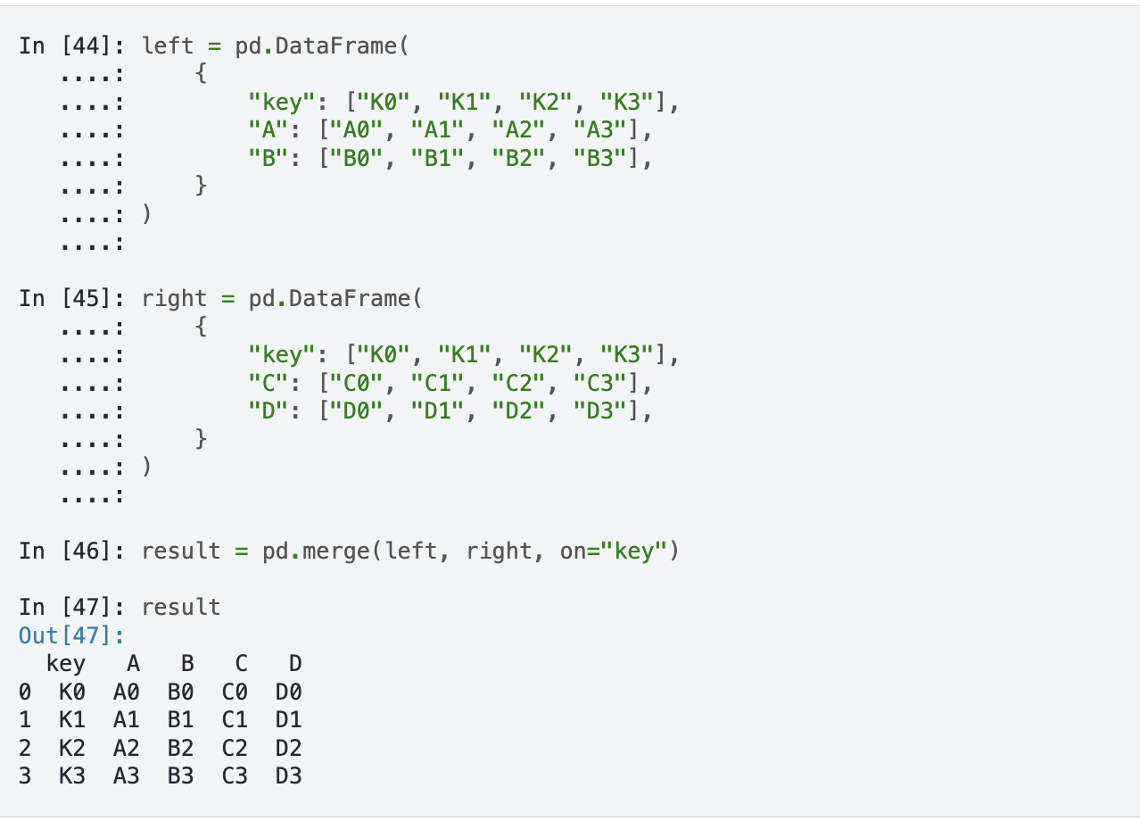
Often when working with datasets, our data is split across multiple files or has different shapes. Pandas lets us merge DataFrames together. The core method is merge(), which takes several key parameters:
left / right — the DataFrames to mergehow — the type of join: left, right, inner, or outeron — the column(s) to join on
There’s also concat() which stacks DataFrames on top of each other, and join() which joins on the index.
Merging Syntax
If we take a look at the documentation, we see the syntax above, which shows us that in Pandas we use the merge() function to combine datasets. The merge() function takes in a number of parameters, but the most important ones are left, right, how, and on. The left and right parameters are the DataFrames we want to merge, the how parameter is the type of join we want to undertake, and the on parameter is the column we want to join the DataFrames on.
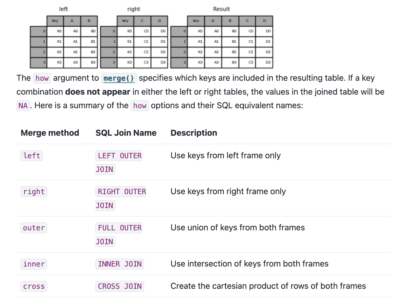
Types of Joins
You’ll notice that we can see a description of the types of how parameters we can use. These are the same types of joins that we discussed in class and in SQL. The how parameter can be set to left, right, outer, or inner. The left join will return all the rows from the left DataFrame and the matching rows from the right DataFrame. The right join will return all the rows from the right DataFrame and the matching rows from the left DataFrame. The outer join will return all the rows from the left DataFrame and the right DataFrame. The inner join will return only the rows that match in both DataFrames.
Finding Common Columns
Now that we are starting to understand this logic, we can consider how we might merge our datasets. First, we can double check the columns in our novels_df and nyt_bestsellers_df DataFrames to see if there are any common columns we can use to merge them.
How can we find the common columns?
set (novels_df.columns).intersection(set (nyt_bestsellers_df.columns))What happens when we merge on these two columns?
We could eyeball the likely similar columns, but we can also use the intersection() method to find the common columns. intersection() is a built-in Python method that returns the common elements between two sets. set() is another built-in Python method that creates a set object, which is an unordered collection of unique elements (somewhat similar to tuples). Sets can be very useful when you want to find the unique elements in a list. In this case, we are using set() to convert the column names of both DataFrames into sets, and then using intersection() to find the common columns.
Attempting to Merge
= novels_df.merge(nyt_bestsellers_df, how= 'left' , on= ['author' , 'title' ])While this code should work, you’ll notice if you print out the merged_df DataFrame that while there are new columns from the nyt_bestsellers_df in our merged_df there only NaN values in those columns. Why is that?
To figure out where we went wrong, we need to check the values in the author and title columns in both DataFrames, and specifically see if any of them exist in both DataFrames. We can do this by using the isin() and nunique() method to get the unique values in each column.
= novels_df[novels_df['author' ].isin(nyt_bestsellers_df['author' ])]['author' ].nunique()= novels_df[novels_df['title' ].isin(nyt_bestsellers_df['title' ])]['title' ].nunique()print (f"Number of shared authors: { shared_authors} " )print (f"Number of shared titles: { shared_titles} " )This output tells us that while there are 122 shared authors, there are no shared titles. This is surprising, so let’s investigate further. There’s a number of ways we could solve this mystery, but let’s first try seeing what the most prolific authors are in both datasets.
Investigating the Most Prolific Authors
'author' ].isin(nyt_bestsellers_df['author' ])]['author' ].value_counts().head(5 )'author' ].isin(novels_df['author' ])]['author' ].value_counts()
This gives us the following output:
John Grisham 19John Steinbeck 8Nicholas Sparks 7Stephen King 7Dan Brown 5Name: author, dtype: int64And now let’s do the same for the nyt_bestsellers_df DataFrame.
This gives us the following output:
Stephen King 892John Grisham 789David Baldacci 396Nicholas Sparks 390Herman Wouk 375We can see that across both datasets Stephen King and John Grisham are the most prolific authors, but we still don’t know why there are no shared titles. Let’s try filtering for the titles in the novels_df and nyt_bestsellers_df DataFrames.
The Problem: Title Casing
= novels_df[novels_df.author == "Stephen King" ].title.unique()= nyt_bestsellers_df[nyt_bestsellers_df.author == "Stephen King" ].title.unique()novels: ['The Stand' 'It' 'The Shining' ...]NYT: ['THE SHINING' 'THE STAND' 'IT' ...]
We can see that King has had many bestsellers and that there is overlap in the titles. However, the titles in the nyt_bestsellers_df DataFrame are all uppercase, while the titles in the novels_df DataFrame are capitalized. This is the reason why there are no shared titles in the two DataFrames — and it’s a perfect segue into talking about Pandas’ built-in string methods.
String Methods in Pandas
df['column'].str.lower()Lowercase all values
df['column'].str.upper()Uppercase all values
df['column'].str.capitalize()Capitalize the first letter of each value
df['column'].str.replace('old', 'new')Replace all instances of one string with another
df['column'].str.split('delimiter')Split a column by a delimiter
df['column'].str.strip()Remove leading and trailing whitespace
df['column'].str.len()Count characters in each value
df['column'].str.contains('pattern')Check if a column contains a pattern
df['column'].str.startswith('pattern')Check if a column starts with a pattern
df['column'].str.endswith('pattern')Check if a column ends with a pattern
df['column'].str.count('pattern')Count occurrences of a pattern in each value
df['column'].str.extract('pattern')Extract the first regex match in each value
df['column'].str.findall('pattern')Find all regex matches in each value
An in-depth discussion of these methods is available in the Pandas documentation https://pandas.pydata.org/docs/user_guide/text.html .
Pandas has a rich set of string methods accessible through the .str accessor. We’ve already seen str.capitalize() used to fix the NYT title casing. But these methods are useful any time you need to clean or analyze string columns.
Full documentation: https://pandas.pydata.org/docs/user_guide/text.html
Fixing the Casing & Merging
# Preserve original, create normalized version = nyt_bestsellers_df.rename(columns= {'title' : 'nyt_title' })'title' ] = nyt_bestsellers_df['nyt_title' ].str .capitalize()If we rerun our shared titles check, we should now see some overlap:
= novels_df[novels_df['title' ].isin(nyt_bestsellers_df['title' ])]['title' ].nunique()print (f"Number of shared titles: { shared_titles} " )
In our case, we can use str.capitalize() to fix the title casing problem in nyt_bestsellers_df. Notice how we first rename the original column so we don’t lose it, then create a new normalized title column: We rename the original title column first so we don’t lose data, then create a normalized version. After this fix we get 12 shared titles — not many, but enough to work with.
Final Merge
= novels_df.merge(nyt_bestsellers_df, how= 'inner' , on= ['author' , 'title' ])= novels_df.merge(nyt_bestsellers_df, how= 'outer' , on= ['author' , 'title' ])= novels_df.merge(nyt_bestsellers_df, how= 'left' , on= ['author' , 'title' ])print (f"Inner merge length: { len (inner_merged_df)} " )print (f"Outer merge length: { len (outer_merged_df)} " )print (f"Left merge length: { len (left_merged_df)} " )This should give us the following output:
Inner merge length: 231Outer merge length: 60876Left merge length: 721So our final merge will be the left merge, which keeps all the novels and adds NYT bestseller data where available.
= novels_df.merge(nyt_bestsellers_df, how= 'left' , on= ['author' , 'title' ])
The different merge types give very different row counts: - Left (721): all 500 novels, some repeated for multiple NYT appearances - Inner (231): only novels that appeared on both lists - Outer (60876): everything from both datasets
We’ll use the left merge so we keep the full novels dataset.
The Full Combined Dataset
Now that we have our combined DataFrame, we also want to bring in the full text of each novel so we can start to explore the text data directly. I’ve included a pre-built version of the combined dataset that has the scraped and cleaned Project Gutenberg texts, plus pre-computed word and pronoun counts, which you can download from Canvas. You can read about the process of creating it here .
The pre-built dataset includes:
All novel metadata (genre, author, publication year, ratings, etc.)
NYT bestseller columns where matched
Pre-computed columns: word_counts, he_counts, she_counts, they_counts
In the rest of this lesson, I will be working with the fully run dataset that includes the text data and pre-computed columns, but you can also follow along with the smaller viz-only dataset if you want to keep things fast.
The full dataset (152 MB) includes the scraped Project Gutenberg texts for each novel. For the lesson page we use a smaller viz-only CSV that has the metadata and pre-computed columns — no raw text. This keeps the page fast to load.
Counting Characters and Words
The simplest measure of a text is its length. We can count the number of characters in each novel using str.len():
'novel_length_chars' ] = combined_novels_nyt_df['eng_text' ].str .len ()'title' , 'author' , 'novel_length_chars' ]].sort_values('novel_length_chars' , ascending= False ).head(10 )To get a more useful word count , we can split the text on spaces and count the resulting list:
'novel_length_words' ] = combined_novels_nyt_df['eng_text' ].str .split().str .len ()'title' , 'author' , 'novel_length_words' ]].sort_values('novel_length_words' , ascending= False ).head(10 )
Searching for Patterns With str.contains()
str.contains() checks whether each value in a column matches a given pattern. This is useful for filtering rows, counting occurrences, or finding subsets of a dataset. For example, how many of the novels in our dataset include the word “war” in their genre field?
'genre' ].str .contains('war' , case= False , na= False )][['title' , 'author' , 'genre' ]]
The case=False argument makes the search case-insensitive, and na=False tells Pandas to treat missing values as non-matches rather than raising an error.
How did we generate the counts columns?
We can also use str.contains() on the text column itself. For example, let’s count how many novels contain the word “she” at all:
'mentions_she' ] = combined_novels_nyt_df['eng_text' ].str .contains(r' \b she \b ' , case= False , na= False )'mentions_she' ].value_counts()Here we use a regex pattern \bshe\b — the \b characters are “word boundaries” that ensure we match the standalone word “she” rather than the letters inside words like “sheer” or “fisherman.”
Next week will cover more advanced text analysis techniques.
Counting Occurrences With str.count()
Rather than just knowing whether a word appears, str.count() tells us how many times it appears. This is especially useful for comparing word frequencies across documents. Let’s count pronouns to start exploring gender representation across our novels:
'he_counts' ] = combined_novels_nyt_df['eng_text' ].str .count(r' \b he \b ' )'she_counts' ] = combined_novels_nyt_df['eng_text' ].str .count(r' \b she \b ' )'they_counts' ] = combined_novels_nyt_df['eng_text' ].str .count(r' \b they \b ' )'title' , 'author' , 'genre' , 'he_counts' , 'she_counts' , 'they_counts' ]].head(10 )
You’ll notice that he tends to be much more frequent than the other two pronouns. Now this might be because of the novels we have in our dataset, but it could also be a reflection of the texts themselves. This kind of question is exactly what EDA is for!
Exploratory Data Analysis
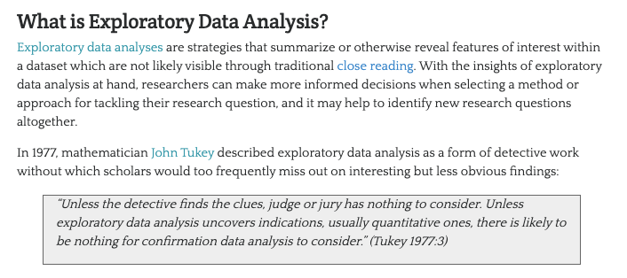
Since we are working with datasets with significant documentation, we have a fairly good sense of what is in these datasets. However, often you will be working with datasets that are less documented, and so it is important to understand how to explore them. This process is often called Exploratory Data Analysis .
John W. Tukey & The History of EDA
In the paper, Tukey writes:
For a long time I have thought I was a statistician, interested in inferences from the particular to the general. But as I have watched mathematical statistics evolve, I have had cause to wonder and to doubt. […] All in all, I have come to feel that my central interest is in data analysis , which I take to include, among other things: procedures for analyzing data, techniques for interpreting the results of such procedures, ways of planning the gathering of data to make its analysis easier, more precise or more accurate, and all the machinery and results of (mathematical) statistics which apply to analyzing data.
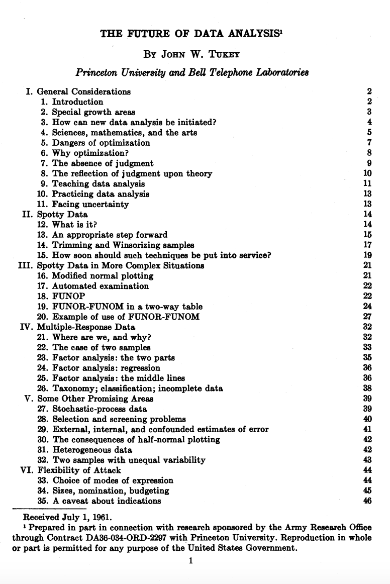
You’ve likely heard this term before, but let’s historically contextualize this idea. The term Exploratory Data Analysis (EDA) was popularized by John W. Tukey, one of the most famous statisticians and mathematicians of the 20th century. Tukey was one of the first to formally define the concept of data analysis in 1962 paper titled “The Future of Data Analysis.”
Such a framing might seem straightforward today in the age of Data Science, but at the time it was a radical shift for how we thought about working with data.
Bell Labs
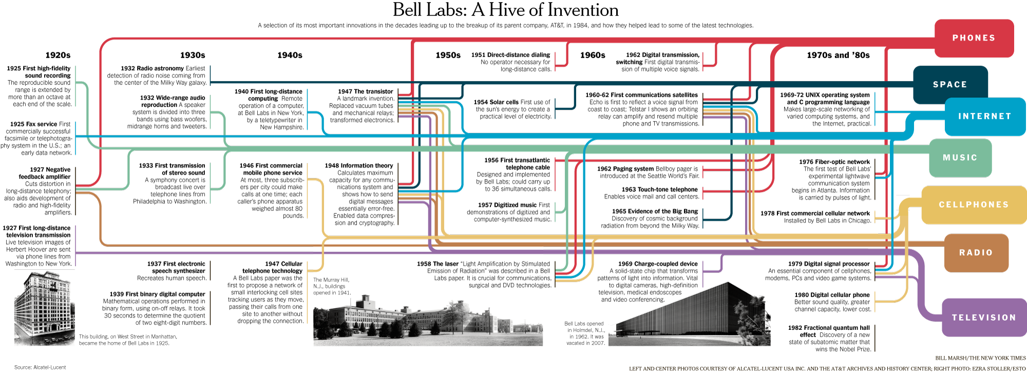
You’ll notice in that image from the paper, which you can download here if you’re curious, that Tukey was affiliated with Princeton University and Bell Telephone Laboratories when he published the paper. Both of these were key institutions in the development of modern computing and statistics. For example, if you’ve heard of Alan Turing or Claude Shannon, they were also affiliated with Bell Labs, and Tukey worked with both of them, especially during World War II.
This infographic gives a sense of some of the inventions and discoveries that happened at Bell Labs, which was one of the most important research and development organizations in the 20th century. In the case of Tukey, he’s credited not just with exploratory data analysis but also coining both the terms bit, a portmanteau of binary digit, and software in 1958. Tukey was a very eclectic scholar, and worked on everything from developing better sampling methods after reviewing the Kinsey report , which was a landmark study of human sexuality released in two books in 1948 and 1953, to developing better methods for election polling.
Tukey’s Principles of EDA
His central thoughts on EDA became the basis for his 1977 book Exploratory Data Analysis , where he argued that EDA could help suggest hypotheses that could be then tested statistically.
Such a shift might again seem obvious today, but at the time most statisticians focused on “confirmatory data analysis”, that is testing a hypothesis statistically rather than exploring the data first to see what might be possible. Tukey’s innovation helped set the groundwork for a lot of modern data science, where we tend to be closer to detectives trying to look for clues rather than approaching data with firm assumptions about what it represents.
While there are not firm principles for EDA, Tukey argued that it should cover the following concepts:
understanding the data’s underlying structure and extracting important variables
detecting outliers and anomalies
and testing underlying assumptions through visualizations, statistics, and other methods, without initially focusing on formal modeling or hypothesis testing. This approach differs with traditional hypothesis-driven analyses, promoting a more flexible and intuitive investigation into the data.
Visualizing Data With Pandas
Now that we have a sense of the distribution of our data, we can start to visualize it to see if we can answer our questions.
Matplotlib & Plots
plot is built into Pandas and is a wrapper around the matplotlib library https://matplotlib.org/ , one of the most popular Python libraries for data visualization. The documentation lists the kinds of plots we can create:
‘line’ : line plot (default)
‘bar’ : vertical bar plot
‘barh’ : horizontal bar plot
‘hist’ : histogram
‘box’ : boxplot
‘kde’ : Kernel Density Estimation plot
‘density’ : same as ‘kde’
‘area’ : area plot
‘pie’ : pie plot
‘scatter’ : scatter plot (DataFrame only)
‘hexbin’ : hexbin plot (DataFrame only)
How to Visualize Our Data?
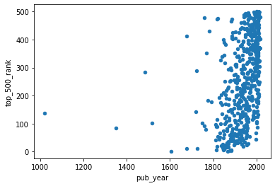
What if we wanted to create a scatter plot looking at the relationship between the pub_year and top_500_rank columns? How can we create this graph?
How to Visualize Our Data?
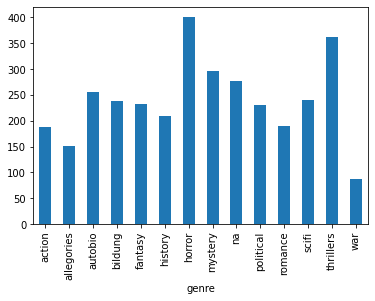
What if we wanted to explore the relationship between genre and the average top_500_rank for each genre? How can we create this graph?
'genre' )['top_500_rank' ].mean().plot(kind= 'bar' )Now that we are starting to see how we can visualize our data, we need to start thinking more deeply about what questions might be of interest to us and how the shape of this data influences how we can answer these questions.
“Cleaning” Data With Pandas
As we’ve discussed previously, cleaning data is core part of working with data but also one that tends to get overlooked or rarely foregrounded, even though it is extremely important for any interpretation. In our current example, we’ve already started to clean our data by merging the DataFrames together and transforming the data to make it more amenable to analysis. We might also want to subset the data, since as we can see above not every book has a genre:
= combined_novels_nyt_df[combined_novels_nyt_df.genre.notna()]
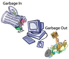
Cleaning Data: GIGO
As we discussed in class, a lot of what motivates this “cleaning”, whether that means normalizing distributions, removing null values, and even transforming some of the data to standardize it, is the concept of GIGO .
GIGO stands for “Garbage In, Garbage Out” and the term has been used for decades in computing to refer to when data entry errors would produce faulty results. Rob Stenson has a great post exploring the history of the term all the way back to Charles Babbage, one of the first inventors of the computer, https://www.atlasobscura.com/articles/is-this-the-first-time-anyone-printed-garbage-in-garbage-out .
GIGO is important because it essentially means that the quality of your data analysis is always dependent on the quality of your data.
However, for as much as we want to prioritize quality, what are some of the downsides or tradeoffs of cleaning data? Some potential considerations include:
losing the specificity of the original data (especially a danger for historic data but also for data collected by certain institutions)
privileging computational power over data quality or accuracy
releasing datasets publicly without documenting these changes
This list is by no means exhaustive! But number one thing to remember with datasets is that the act of collecting data is in of itself an interpretation . And so cleaning data adds another layer of interpretation (sometimes many layers) to the dataset, which is why its crucial to keep a record of how you transform your data.
It is also important to realize that even with cleaning you will never have a perfect dataset and to remember that this is often an iterative process and not a one time thing. You will likely need to re-transform your data many times depending on your methods.
One best practice is to save multiple versions of your dataset as csv files, so that you don’t either overwrite your original data or have to rerun previous transformations. Remember that with Pandas we can read and write csv files using pd.read_csv() and {name of your dataframe}.to_csv().
Types of Data
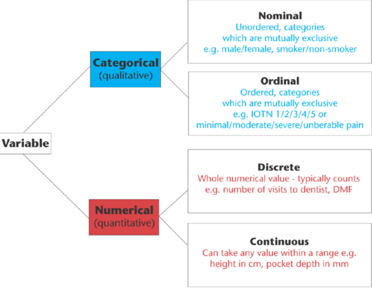
In addition to thinking about our choices, it is also important to think about the types of data we are working with.
Data broadly divides into qualitative (categorical) and quantitative (numerical) types. These map loosely onto Pandas dtypes but go beyond them.
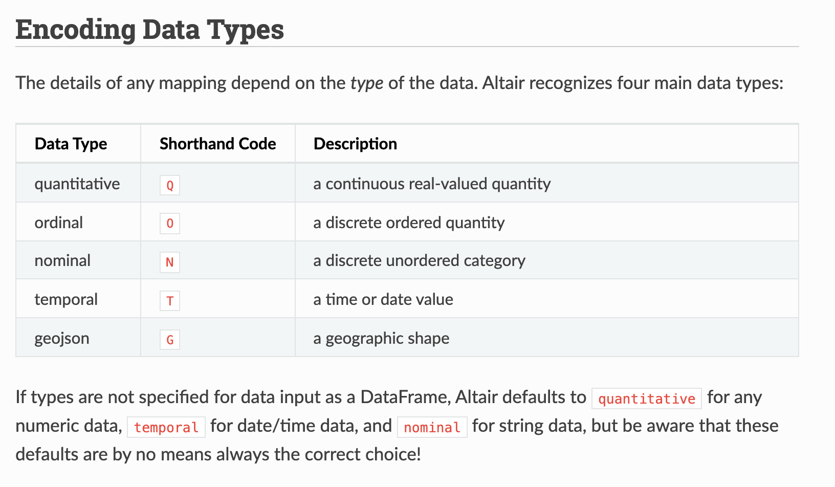
This graph outlines the main types of data you might encounter, which largely breaks down between qualitative (categorical) or quantitative (numerical). Now these data types somewhat overlap with our .dtypes in Pandas, but they also go beyond. For example, what in our dataset might be Nominal versus Ordinal, or Discrete versus Continuous? To help answer this question, we are going to explore data visualization more in depth with the Python library Altair.
Data Visualization in Python
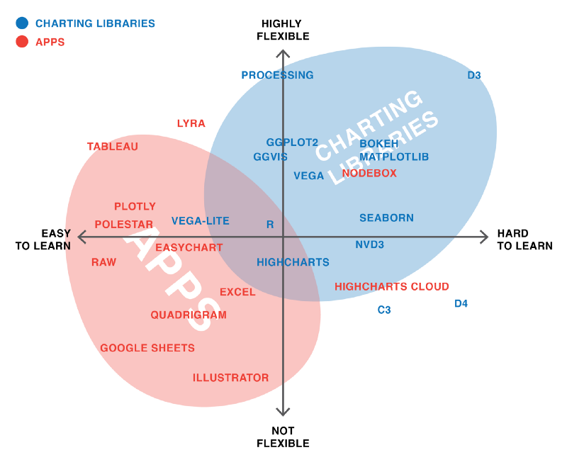
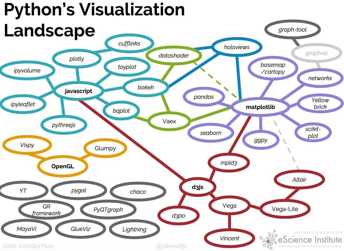
Up to now we’ve been using Pandas built in plot methods to display our data. While this is helpful for quick analyses, you’ll likely want more options for both how you visualize the data and interact with it. As you can see in these graphics, in Python, there are a number of visualization libraries, including Matplotlib, Seaborn, and Plotly that have extensive communities and documentation.
Data Visualization With Altair
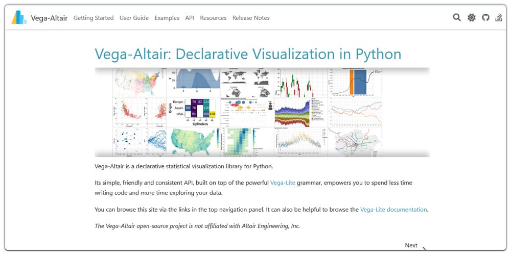
Today we’re going to focus on Vega-Altair , which is a Python library built on top of Vega and Vega-Lite - two visualization libraries for JavaScript. Previously, this library was known as just Altair so for brevity in this lesson we will refer to it as such. The library was started in 2016 by Jake VanderPlas and has since grown to be one of the most popular libraries for data visualization in Python.
Installing Altair
Remember to activate your virtual environment!
pip install "altair[all]"
Notice that this time when installing we have a slightly new syntax: [all]. This syntax just means that we will be installing all of Altair’s dependencies and optional dependencies.
Using Altair
Now we can try out Altair with one of the built-in datasets
import altair as altfrom altair.datasets import data= data.cars()= 60 ).encode(= 'Horsepower' ,= 'Miles_per_Gallon' ,= 'Origin' ,= ['Name' , 'Origin' , 'Horsepower' , 'Miles_per_Gallon' ]
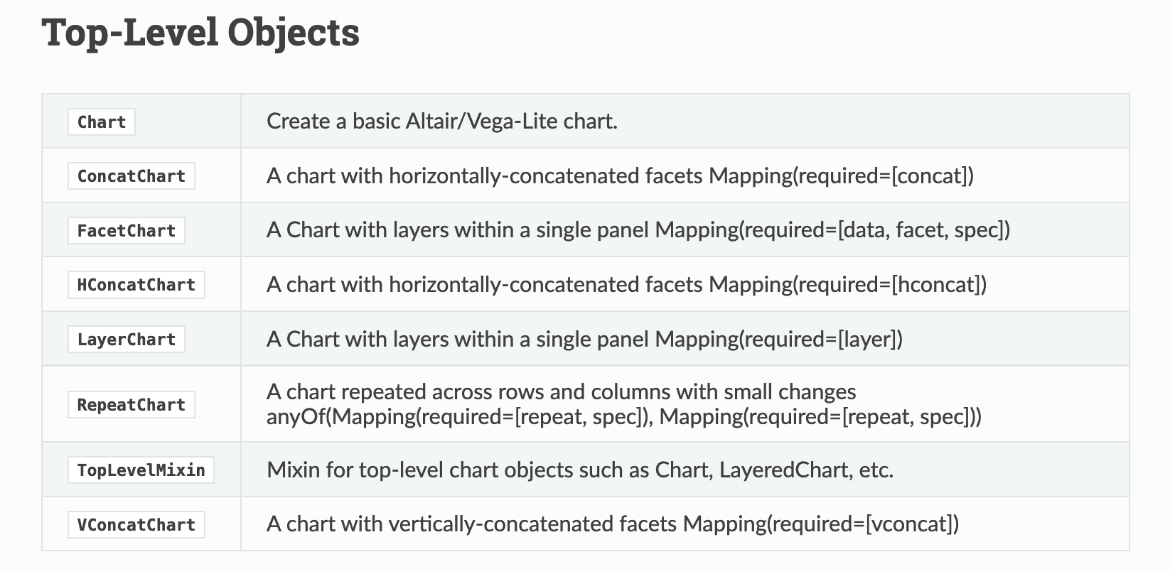
Altair Class
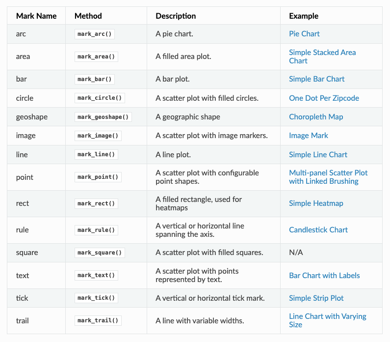
Altair Marks
Altair Encodings
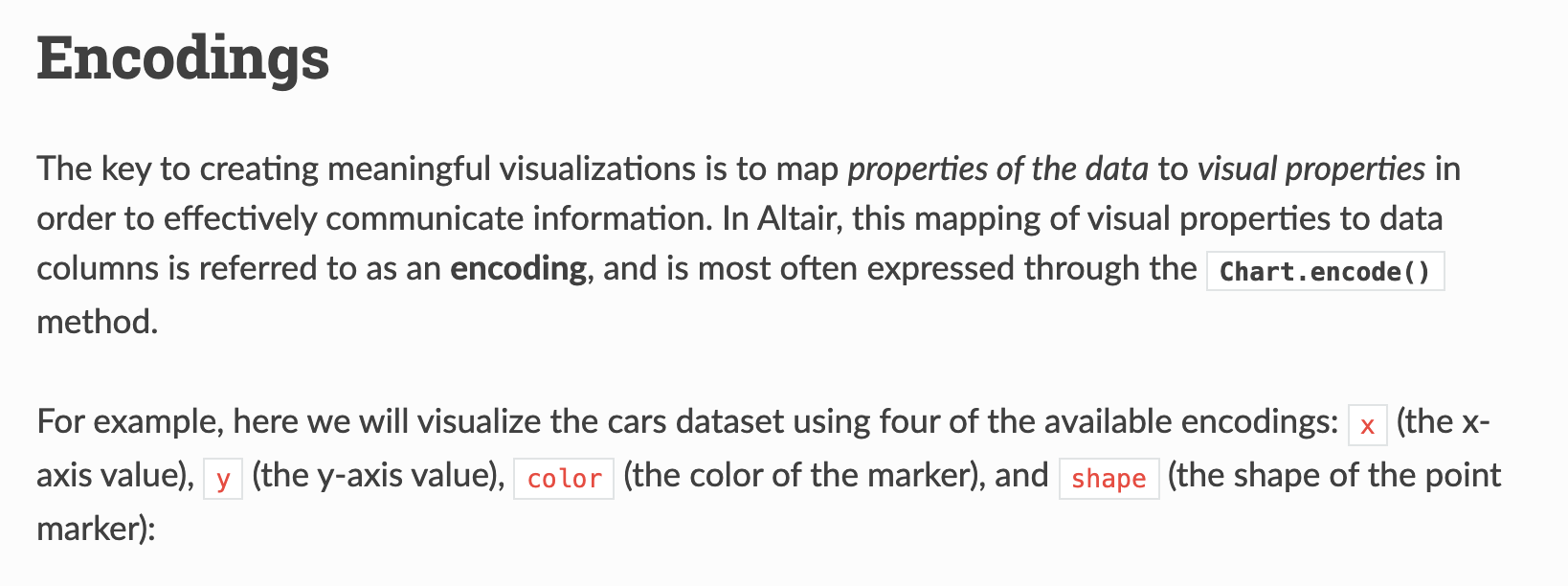
Finally, we specify the encoding of our graph, which is how we map our data to visual properties. In our example, we are encoding Horsepower to the x-axis, Miles_per_Gallon to the y-axis, and Origin to the color of the points. We are also adding a tooltip encoding that allows us to see more information about each point when we hover over it.
Trying It Out
Now that we understand a bit of Altair’s syntax, let’s try to recreated our genre by average top_500_rank plot that we made previously. To do this, we don’t have to do groupby, instead Altair can handle most of the logic for us:
'genre' , 'top_500_rank' ]]).mark_bar().encode(= "genre:N" ,= "mean(top_500_rank):Q" ,You can read more about aggregation here https://altair-viz.github.io/user_guide/transform/aggregate.html#aggregation-functions .
We can see that some of the syntax is similar to the initial example. We are passing in our DataFrame to the Chart class, calling the mark_bar method, and then encoding the x and y axis. But some of this syntax is also new.
For instance, we are specifying the encodings using the N for nominal and Q for quantitative. We are also using an aggregate function to calculate the mean.
You can also see links to examples using these aggregations here https://altair-viz.github.io/user_guide/encodings/index.html#aggregation-functions .
While it’s great we can recreate this plot, what’s the point exactly? After all we can do this in plot without having to use another library.
The value of using a library like Altair is that it is built to implement the idea of a Grammar of Graphics.
The Grammar of Graphics
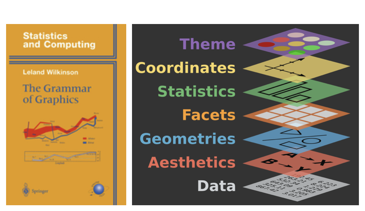
In The Grammar of Graphics , every visualization is built using the following core components:
Data: The dataset that you want to visualize.
Mappings: How the data variables map to visual properties like axes, colors, or sizes.
Geometries (Marks): The basic shapes used to represent the data, such as points, lines, bars, etc.
Statistical transformations: Aggregations or transformations applied to the data, such as grouping, counting, or averaging.
Scales: How data values are translated into visual values, like positioning on the x- or y-axis.
Coordinates: The coordinate system used, such as Cartesian or polar coordinates.
Faceting: How the data is split into different panels or sections to show comparisons.
The Grammar of Graphics is both a concept and book published in 1999 by Leland Wilkinson, a statistician and computer scientist. Wilkinson developed this idea from his experience in developing SYSTAT, a statistical software package he founded in 1983, where he saw the need for a more structured and flexible framework for data visualization.
Wilkinson’s grammar aimed to define a set of rules or components that could describe any kind of statistical graphic, from simple bar charts to complex scatter plots and heatmaps. By breaking down graphics into fundamental elements (like data, geometries, and scales), his grammar provides a way to think of visualizations as composable and modular—allowing users to understand and generate diverse charts based on clear principles. Wilkinson’s ideas have influenced many modern visualization tools and libraries like ggplot2 in R, as well as Altair.
Altair is built around these principles, making it easier to create clear and interpretable visualizations by specifying each component in your code. This approach is not only flexible but also emphasizes transparency, helping you understand how your data is represented visually. It’s also more extensible, allowing for more complex and interactive visualizations, such as linked plots or selections, which would be difficult to achieve with simpler plotting libraries.
By embracing the Grammar of Graphics, Altair enables you to think more abstractly about the relationship between data and visualization, offering a consistent, rule-based system to produce a wide variety of visual outputs.
Pronoun Counts by Genre
How could we visualize if certain genres more likely to use particular pronouns? What columns would we pass to Altair as encodings?
Let’s explore this code!
= pd.melt(= ['title' , 'author' , 'pub_year' , 'genre' ],= ['he_count' , 'she_count' , 'they_count' ],= 'pronoun' ,= 'pronoun_count' = lambda df: df['pronoun' ].str .replace('_count' , '' ))
Reshaping Data With Pandas
Melting in Pandas is a way to reshape your data from wide to long, since sometimes you want to look at the relationship between multiple columns. In this case, we are melting the they_counts, she_counts, and he_counts columns into a single long-form DataFrame with the pronoun name in one column and the count in another. A “wide” DataFrame has one column per pronoun (he_count, she_count, they_count). A “long” DataFrame has one row per pronoun-novel combination, with a pronoun column and a count column. Altair works much better with long-form data.
pd.melt() transforms a wide DataFrame into a long one. Key parameters:
id_vars — columns to keep as-is (they identify the row)value_vars — columns to “melt” into rowsvar_name — name for the new column that holds the old column namesvalue_name — name for the new column that holds the values
This is one of the most useful reshaping operations in Pandas. You’ll also encounter pivot() and pivot_table() which do the reverse. More at: https://pandas.pydata.org/docs/user_guide/reshaping.html
Putting It All Together
import pandas as pdimport altair as alt= pd.melt(= ['title' , 'author' , 'pub_year' , 'genre' ],= ['he_counts' , 'she_counts' , 'they_counts' ],= 'pronoun' ,= 'pronoun_count' = lambda df: df['pronoun' ].str .replace('_count' , '' ))= alt.selection_point(fields= ['pronoun' ], bind= 'legend' )'genre' ].notna()][['genre' , 'pronoun' , 'pronoun_count' ]]).mark_bar().encode(= alt.X('genre:N' , title= 'Genre' , sort= '-y' ),= alt.Y('sum(pronoun_count):Q' , title= 'Total Pronoun Count' ),= alt.Color('pronoun:N' , title= 'Pronoun' ),= alt.condition(selection, alt.value(1 ), alt.value(0.2 )),= ['genre:N' , title= 'Genre' ),'pronoun:N' , title= 'Pronoun' ),'sum(pronoun_count):Q' , title= 'Count' , format = ',' )= 'Pronoun Counts by Genre' ,= 600 ,= 400
Altair Interactivity: Selections
Full interactivity documentation: https://altair-viz.github.io/user_guide/interactions/index.html
= alt.selection_point(fields= ['genre' ], bind= 'legend' )= alt.condition(selection, alt.value(1 ), alt.value(0.2 ))
alt.selection_point() creates an interactive selection. By binding it to the legend (bind='legend'), clicking a legend item highlights that category and fades the rest.
alt.condition() applies a conditional encoding — full opacity for selected items, 20% opacity for everything else. This is a core pattern for interactive filtering in Altair.
This visualization starts to let us ask research questions: are certain genres more likely to use masculine pronouns? Does that change over time? These are exactly the kinds of hypotheses that EDA can surface before we move to more rigorous methods.
Handling Dates in Altair
What happens if we use pub_year directly as a temporal encoding?
'pub_year' , 'genre' ]]).mark_bar().encode(= "pub_year:T" ,= "count():Q" ,= "genre:N"
We could also see these patterns over time. Altair is great at visualizing dates, however, you’ll notice our primary date column, pub_year only has the year in it. If we try to use it in Altair as is, we get the following graph: Altair’s :T (temporal) encoding expects a proper datetime column, not a plain integer.
Dates in Pandas
To fix this, we can create a pub_date column:
'pub_date' ] = pd.to_datetime('pub_year' ].astype(str ) + '-01-01' ,= 'coerce' We append -01-01 to make a full date string (January 1st of each year), then use pd.to_datetime() to parse it. errors='coerce' turns any unparseable values into NaT (Not a Time) rather than raising an error.
Top 500 Novels by Genre Over Time
Click a genre in the legend to highlight it
#| label: fig-genres-over-time #| fig-cap: "Top 500 Novels by Genre Over Time" = alt.selection_point(fields= ['genre' ], bind= 'legend' )'pub_date' , 'genre' ]]).mark_bar().encode(= alt.X('pub_date:T' , title= 'Publication Year' ),= alt.Y('count():Q' , title= 'Number of Novels' ),= alt.Color('genre:N' , title= 'Genre' ),= ['genre:N' , 'count():Q' ],= alt.condition(selection, alt.value(1 ), alt.value(0.2 ))!= None = 'Top 500 Novels by Genre Over Time' ,= 800 ,= 400
This is our final chart — it combines everything we’ve learned: the merged dataset, Altair’s Grammar of Graphics, temporal encoding, and interactive selections.
The chart shows how the genre composition of canonized novels has shifted across publication years. Try clicking different genres to isolate them. Notice that “Novel” (unclassified) dominates early periods, while specific genre labels become more common in the 20th century — is that a feature of the novels themselves, or of how genre metadata was assigned?
The full code for this chart is in the lesson materials.
Homework: Exploring and Visualizing Culture
Create a new Jupyter Notebook in is310-coding-assignments/pandas-eda/.
Title it in CamelCase reflecting your focus (e.g. GenderTrendsInTopNovels)
Use Altair for all visualizations
Include prose interpreting each chart
Engage critically with the data — identify patterns, gaps, potential biases
Post your link in the GitHub discussion .
There are no right or wrong answers for this assignment. The goal is to start implementing EDA as Tukey envisioned it — as a detective process, not a confirmatory one.
You could focus on comparisons between the two datasets, correlations between metadata fields, or use the pre-computed text columns to start exploring language patterns. Whatever you choose, make sure you can explain your choices and what the visualizations actually show.
Remember to include either remote or local access to the datasets, avoid pushing your virtual environment, and document your folder with a README.md.